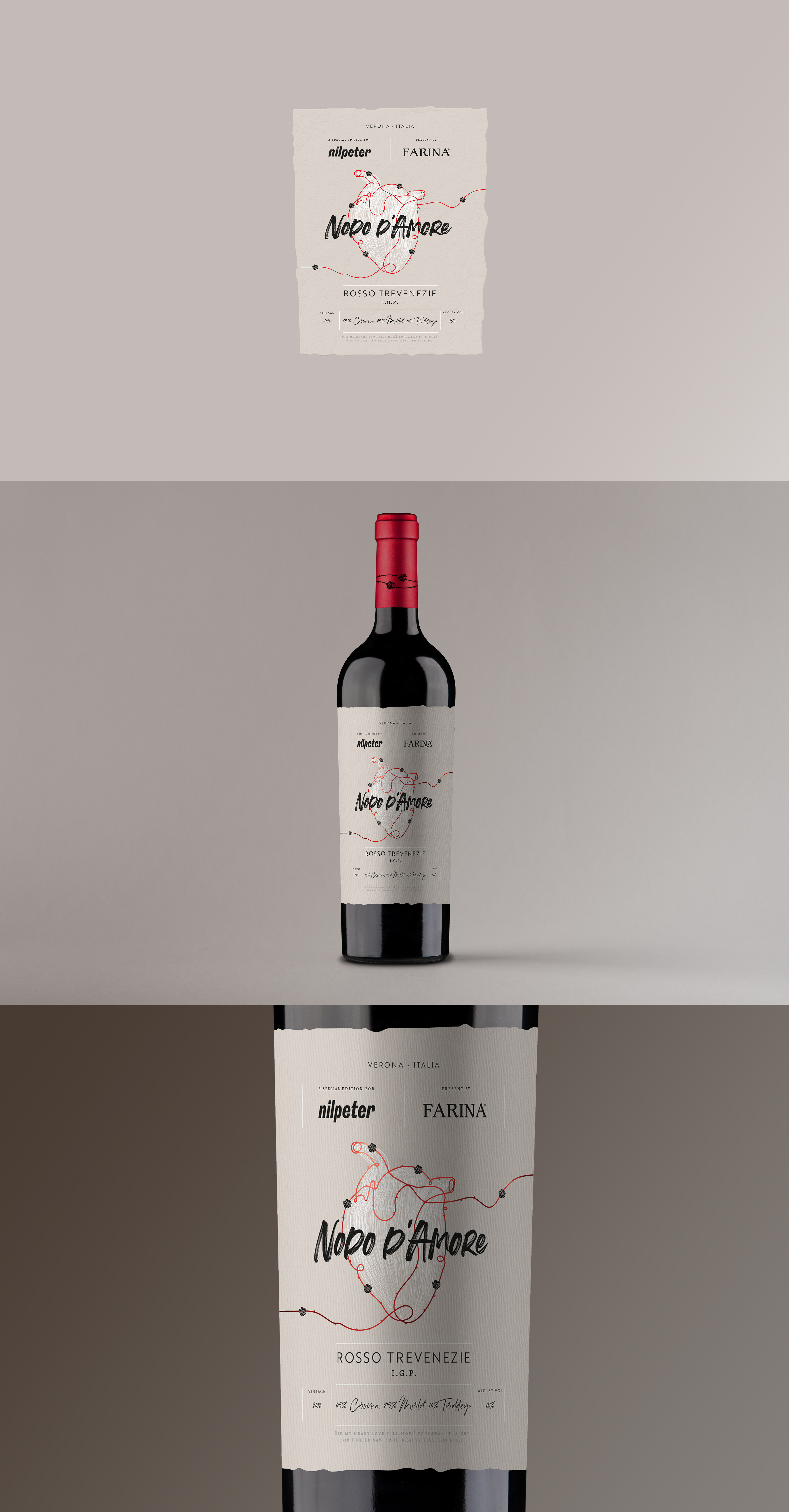
In the graphic piece we work with symbols and contrasts. In the symbolic, the idea of working the heart made with a single stroke that alludes to the legend of the Red Thread tied to the hands of its protagonists. At the same time show the voragine with which events are given, the route as the entanglements of the plot, the roses as the strong element of the work of denying "the name". In contrast, the piece is worked with a modern style, like graffiti, the same that we find today in the "Juliet's house" emphasizing that it is a young wine. But in turn, the color of the label is also worked like an aged paper by Shakespeare himself, alluding to the trajectory of the winery that makes it. The label seeks to equate an epic love like Romeo and Juliet, with the passion that is put when creating the wine. Represent the love and passion of these lovers as the one that the winery has when creating a masterpiece that is wine, these in the same setting, Verona.